Last Updated: November 2, 2026
Quick Summary
The best paper types for ai wall decor are matte premium paper for soft, painterly images, satin canvas for large statement pieces, and framed poster prints for a balance of cost and finish. Match the finish to your image's contrast and your room's lighting rather than choosing the most expensive stock.
- Matte paper scatters light and visually softens upscaling artifacts in soft AI images.
- A 16 x 20 inch print at 300 DPI needs 4,800 x 6,000 pixels.
- Glossy photo paper is the worst choice for heavily upscaled files.
- Premium matte and satin photo stock typically falls in the 260-310 GSM range.
- In bright, sunny rooms choose matte or satin lustre to kill reflections.
Table of Contents
Quick Comparison: Paper Types for AI Wall Decor
The best paper for AI-generated wall decor depends on how you want the image to feel, not just how it looks on screen. Matte premium paper suits soft, painterly AI art. Satin canvas handles large statement pieces. Framed poster prints split the difference on cost and finish.
This guide breaks down the real differences between paper stocks, finishes, and weights so you can order with confidence. Below, we'll show you exactly how to match a paper type to your image, your room, and your budget.
| Paper Type |
Finish |
Best For |
Pros |
Cons |
| Matte premium paper |
Flat, no glare |
Painterly, soft, low-contrast AI art |
No reflections, rich texture |
Can look flat under weak light |
| Glossy photo paper |
Reflective, high shine |
Vivid color, sharp detail |
Deep blacks, high color pop |
Glare near windows, fingerprints |
| Satin lustre |
Low sheen |
Portraits, mixed lighting |
Balanced reflection, easy to clean |
Less punch than gloss |
| Satin canvas |
Woven texture |
Large statement pieces |
Durable, ready to hang |
Softer fine detail |
| Fine art cotton rag |
Textured, matte |
Gallery-style prints |
Archival, acid-free feel |
Higher cost, delicate surface |
The Best Paper for Digital Art Prints: What Actually Matters
The best paper for digital art prints is one that matches the image's contrast and the room's light, not the most expensive stock on the shelf. For a broader look at how paper fits into the whole picture, see this guide to AI-generated art for home decor. Paper weight, finish, and coating decide how an AI image reads once it leaves the screen.
Three things matter more than brand names. First, surface reflection: a glossy sheet bounces light and can wash out a dark, moody AI render. Second, texture depth: a woven or cotton surface adds physical character that flat screens can't show. Third, color gamut: how wide a range of color the paper and ink can hold.
What most guides miss is that AI images often arrive with softer edges and compressed gradients. A matte finish can hide those soft transitions. A high-gloss sheet can magnify them. That single fact should drive most of your decision.
Matte Paper for Art Prints: Why AI Art Often Looks Better Without Glare
Matte paper for art prints suits AI-generated images because it reduces glare and can soften digital artifacts. A flat surface scatters light instead of bouncing it, so the viewer sees the image, not a reflection of the window behind them.
Consider what AI art usually contains: smooth gradients, blended skies, soft shadows, and the occasional compression band. Gloss amplifies every one of those flaws. Matte absorbs them. The result looks intentional, like a painted surface rather than a screenshot.
-
Best for: dreamy landscapes, abstract washes, muted palettes, dark moody scenes
-
Skip if: your image is a high-contrast graphic with razor-sharp text or linework
The tradeoff is real. Matte can look flat in a dim room, and it shows smudges more than satin.
Canvas vs Poster vs Fine Art Paper: Matching Medium to Image
Canvas, poster, and fine art paper each change how an AI image reads. Canvas adds texture and presence for large pieces. Poster paper keeps costs down for bold graphics. Fine art paper delivers gallery-grade detail for smaller, precious prints.
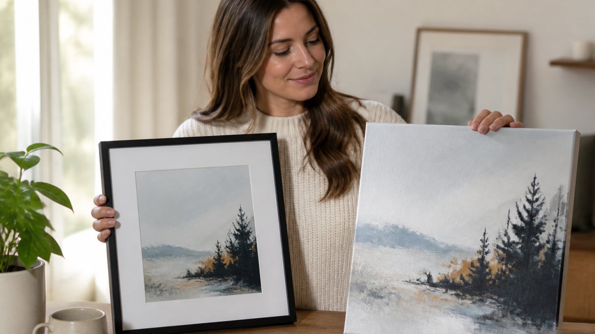 Comparison chart visualizing the texture differences between a matte framed print and a stretched canvas art piece.
Canvas suits large statement pieces. The woven surface softens fine detail but adds depth. Our Urban Grunge on a Block Wall Art Print on Satin Canvas shows how satin canvas handles a gritty, textured AI image with real presence.
 Urban Grunge on a Block Wall Art Print on Satin Canvas
Poster prints in a frame are the practical middle ground. A framed poster gives you a matte premium surface in a frame. The Alpaca Cino 'Designed by AI' Large Wall Art, Framed Print is a good example: matte paper, a wood frame in black or white, and seven sizes.
 Alpaca Cino 'Designed by AI' Large Wall Art, Framed Print
Fine art paper rewards close viewing. Cotton rag and acid-free stocks hold detail and feel substantial.
How to Print AI-Generated Art: Resolution, Upscaling, and Color
Printing AI-generated art starts with resolution. A file that looks crisp on a monitor can turn soft at large sizes, so check your pixel dimensions before you order. As a general rule, aim for roughly 300 DPI at the final print size, and upscale your image first if it falls short.
Do the math before you pick a paper. If you want to preview the result first, learn about using AI to visualize custom wall art. A 16 x 20 inch print at 300 DPI needs 4,800 x 6,000 pixels. Most AI generators output far less than that natively, which is why upscaling is not optional for large wall decor.
Upscaling is a step many people skip. AI generators often output images that are sharp on screen but thin on pixels. Running the file through an upscaler before printing, then inspecting the result at full zoom for smearing or invented detail, can help. Paper choice and upscaling are closely linked.
Upscalers such as Topaz Gigapixel and Magnific can invent plausible detail, but they may also leave artifacts: over-sharpened edges, waxy skin, and repeating micro-textures in smooth areas. The paper finish you choose either hides or highlights those artifacts:
Alpaca Cino 'Designed by AI' Large Wall Art, Framed Print →
-
Matte and cotton rag: the textured surface scatters light and visually softens upscaling artifacts. Best for painterly, soft, or low-contrast AI images that were upscaled aggressively.
-
Satin lustre: a middle ground. It holds detail without mirroring it, so mild upscaling artifacts stay subtle.
-
Glossy photo paper: the worst choice for heavily upscaled files. The reflective surface magnifies over-sharpened edges and invented detail, and viewers standing close will see the seams.
A practical workflow: upscale first, then zoom to 100% and look for waxy patches or repeating patterns. If you see them, drop to a matte or textured stock. If the upscaled file is clean, satin or gloss will reward the extra detail.
Color is another consideration. Screens glow; paper reflects. Colors that pop in RGB can print duller, especially on matte stock. Soft-proofing your file, if your editing tool allows it, can help you anticipate shifts in deep blues and saturated reds.
A quick pre-print checklist:
- Confirm pixel dimensions match your target print size (width x height x 300)
- Upscale if the file is under target resolution
- Inspect the upscaled file at 100% for smearing or invented detail
- Match paper finish to the severity of upscaling artifacts
- Soft-proof colors and adjust saturation and shadow lift
- Save as a print-ready file at the highest quality setting
GSM, Archival Quality, and the Specs That Decide Longevity
GSM means grams per square meter, and it measures paper weight. Higher GSM generally means a thicker, sturdier sheet. For wall art, a heavier stock can feel more substantial in the hand.
Here is how the ranges actually break down for AI wall decor:
-
120-170 GSM: standard poster and bond paper. Generally suited to short-term framed prints.
-
200-250 GSM: entry-level photo paper. Acceptable for small framed prints.
-
260-310 GSM: premium matte and satin photo stock. Often used for framed AI wall decor.
-
310-400 GSM: fine art cotton rag and heavy card stock. Offers a substantial hand feel.
-
400 GSM and up: canvas substrates and rigid boards. Some canvas styles are built on a 400gsm fabric with a closed MDF backing.
Archival quality is another spec to consider. Acid-free papers can resist yellowing, and pigment-based inks are generally known for longer color retention than dye-based inks.
Watch out: direct sun can fade prints over time. Consider keeping art off sun-exposed walls, and be mindful of humidity in damp rooms.
Matching Paper Finish to Your Room's Lighting
Room lighting can influence which finish looks best. Bright, window-facing walls can make glossy paper glare. Dim, cozy rooms can make matte paper look flat.
-
Bright, sunny rooms: choose matte or satin lustre to kill reflections
-
Dim or lamp-lit rooms: satin or a light gloss adds life and depth
-
Mixed lighting: satin lustre is the safe middle ground
-
Gallery walls with spotlights: matte avoids hot spots under beams
Think about the time of day you actually use the room. For the full process, see this step-by-step guide to creating unique canvas prints with AI. A home office lit by a desk lamp needs a finish that catches warm light without mirroring it. A hallway with a skylight needs glare control above all.
Ordering Your AI Wall Decor Print
Ordering AI wall decor comes down to four decisions: image, medium, size, and finish. Getting these right helps the print match the picture you have in mind.
Here is how we would approach it:
-
Finalize the image and upscale it to your target size.
-
Pick the medium: canvas for large focal pieces, framed poster for most rooms, fine art paper for small detailed prints.
-
Choose the size against your wall, not the screen. Tape the dimensions on the wall first.
-
Match the finish to your room's light.
- **
At Vireous.Shop, designs can be generated using OpenAI-powered tools or chosen from our AI-inspired library, then printed made-to-order. You can start from a natural-language prompt. When you're ready, follow the steps above to order.
Frequently Asked Questions
What kind of paper is best for printing digital art?
Matte paper and textured papers are often chosen for digital art prints because they can reduce glare under room lighting. If you want texture, cotton rag adds a visible grain that suits painterly or surrealist images.
Is matte or glossy paper better for AI art prints?
Matte paper for art prints wins in most rooms because it scatters light instead of reflecting it. Glossy photo paper produces deeper blacks and more saturated color, but it also mirrors windows, lamps, and ceiling lights, which hides detail. AI images often contain soft gradients and subtle color transitions, and glossy surfaces amplify banding in those areas.
Can you print AI-generated art on canvas or fine art paper?
Canvas and fine art paper are both options for printing AI-generated files, provided the resolution is sufficient for the target size. The main requirement is a print-ready file: check DPI and PPI before ordering, since a file that looks sharp on screen can blur once stretched across a large canvas.
How should you prepare an AI-generated image for printing?
A general approach is to upscale the image to the resolution your print size needs and check it at 100 percent zoom for artifacts. Confirm the aspect ratio fits your chosen frame or canvas dimensions and save a high-quality file.
The hardest part of AI wall decor isn't generating an image. It's choosing the paper that does it justice. Vireous.Shop takes the guesswork out with made-to-order framed prints and satin canvases, same-day or next-day dispatch on personalized items, and a Money Back Guarantee if the print isn't what you expected. Customize your design, preview it before checkout, and let your imagination become something you can hang on the wall.