

Table of Contents
- Why Accurate AI Design Previews Matter
- AI Design Prompt Engineering Tips for Better Results
- Best AI Tools for Graphic Design Accuracy
- How to Improve AI Image Generation Accuracy
- Building Consistency Into Your Design System
- Common Mistakes That Reduce Preview Accuracy
- Conclusion
Last Updated: August 14, 2026
Why Accurate AI Design Previews Matter
Getting accurate AI design previews has become essential for anyone creating custom merchandise, wall art, or branded apparel. The gap between what you imagine and what you receive can be frustrating, especially when you're relying on AI-generated designs to represent your brand or vision.
The challenge isn't that AI design tools are unreliable. It's that most creators don't know how to communicate their vision effectively to these systems. A poorly structured prompt produces muddy, inconsistent, or off-brand results. A well-engineered prompt with iterative refinement produces work that matches your mental image and translates accurately to the final printed product.
At Vireous.Shop, we've seen this pattern repeatedly. Creators who take time to understand prompt engineering and validation workflows see dramatically better results. They get designs that preview accurately, print cleanly, and require fewer revisions. Those who skip this step waste time, money, and creative momentum.
This guide walks you through the exact techniques that separate mediocre AI previews from production-ready designs. You'll learn how to structure prompts for visual consistency, use iterative workflows to refine output, validate designs against your brand standards, and catch accuracy issues before they reach print.
OpenAI's DALL-E documentation on prompt optimization provides foundational guidance on prompt structure. But the real power comes from combining that foundation with design-specific validation techniques and post-generation refinement methods that most guides overlook.
AI Design Prompt Engineering Tips for Better Results
Effective prompt engineering is the foundation of accurate AI design previews. The difference between a vague prompt and a structured one often determines whether you get a usable design or something that misses the mark entirely.
Start with specificity. Instead of "make a cool t-shirt design," describe exactly what you want: "Create a minimalist logo design for a tech podcast featuring a microphone icon in a geometric style, using only navy blue and white, 3-inch square format suitable for screen printing." The more constraints you provide upfront, the fewer iterations you'll need.
Structuring Prompts for Visual Consistency
A well-structured prompt breaks down into distinct components: subject, style, technical constraints, and output specifications. This architecture ensures the AI model understands your intent across all dimensions of the design.
Start with the core subject. What is the design about? Be specific about elements, composition, and focal points. Then specify the style: minimalist, vintage, photorealistic, hand-drawn, geometric. Add technical constraints like color palette, dimensions, and intended medium. Finally, include output specifications: "suitable for screen printing on cotton," "optimized for Instagram Stories," or "high contrast for vinyl cutting."
A complete structured prompt looks like this: "Design a wall art print featuring a mountain landscape at sunset with a lone pine tree in the foreground. Style: contemporary minimalist with bold geometric shapes. Colors: warm oranges, deep purples, and charcoal gray. Dimensions: 24x36 inches. Medium: ready for canvas printing with high saturation and crisp edges."
This structure gives the AI model clear guidance on every aspect of the design. It reduces ambiguity and increases the likelihood that your preview matches your expectations.
Using Iterative Workflows to Refine Output
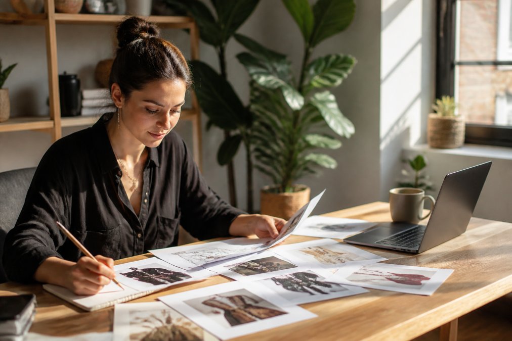
No prompt is perfect on the first attempt. The iterative workflow, generating, evaluating, adjusting, and regenerating, is where accurate design previews actually happen.
Start with your initial prompt and generate three to five variations. Don't pick the first one that looks acceptable. Compare all variations side by side. Which one captures your vision most closely? What's missing or off about the others? This comparison reveals what your prompt communicated effectively and where it fell short.
Once you've identified the strongest direction, refine your prompt based on what you learned. If the color palette shifted in an unexpected direction, add more specific color names. If the composition felt off-center, specify placement: "subject positioned in the upper left quadrant." If the style drifted toward photorealism when you wanted illustration, explicitly state the style constraint again.
Generate another batch with the refined prompt. You should see measurable improvement. The design gets closer to your vision with each iteration. Most creators need two to four rounds of iteration before they have a preview they're confident printing.
This iterative approach also helps you understand how the AI model interprets language. You learn which descriptors produce consistent results and which ones create ambiguity. Over time, your prompts become more efficient, and your turnaround time improves.
Best AI Tools for Graphic Design Accuracy
Different AI models have different strengths for design accuracy. Understanding these differences helps you choose the right tool for your specific project.
Comparing Model Capabilities for Design Fidelity
DALL-E 3, integrated into Vireous.Shop's platform, excels at understanding detailed, natural-language prompts and producing designs with strong visual coherence. It handles complex requests, multiple elements, specific color relationships, composition constraints, better than earlier models. The design fidelity is consistently high, which matters when you're printing merchandise or wall art.
Other models like Midjourney and Stable Diffusion have their own strengths. Midjourney produces highly stylized, artistic outputs and handles abstract concepts well. Stable Diffusion offers flexibility for local processing and fine-tuned models. But for commercial design work where accuracy and brand alignment matter, DALL-E 3's natural-language understanding and consistency make it the stronger choice for most creators.
The key difference comes down to how well the model translates your prompt into visual output. DALL-E 3 maintains design intent across iterations. If you ask for "navy blue and white," it stays within that palette across multiple generations. If you specify "minimalist style," the output respects that constraint even when you add new elements.
Evaluating Output Quality and Aesthetic Scores
After generating designs, evaluate them against specific criteria rather than gut feeling. Create a simple evaluation framework: Does the design match the intended style? Are colors accurate to what you specified? Is the composition balanced? Does it work for the intended medium, screen printing, canvas, apparel?
Rate each design on these dimensions using a simple 1-5 scale. This forces you to be objective about quality rather than accepting the first acceptable result. A design that scores 4 or 5 across all dimensions is production-ready. Anything below that needs refinement.
Look for common accuracy issues: color shift (the preview shows one shade but the model generated another), composition drift (elements aren't positioned where you specified), style inconsistency (the design feels photorealistic when you asked for illustration), and technical problems (low contrast, muddy details, or artifacts).
Design accessibility guidelines from WCAG provide useful criteria for evaluating contrast and visual clarity. Even if accessibility isn't your primary concern, these standards help you spot designs that might print poorly or fail to read at smaller sizes.
How to Improve AI Image Generation Accuracy
Accuracy in AI image generation comes from three sources: strong prompts, iterative refinement, and post-generation validation. Each layer adds precision.
Post-Generation Refinement Techniques
After you've generated a design that's close to your vision, refinement techniques can push it further. One approach is selective regeneration: take your best design and ask the AI to regenerate just specific elements. "Keep the composition and color palette the same, but make the central figure more detailed and photorealistic."
Another technique is style transfer. Generate your design, then use a second prompt to apply a different aesthetic to the same composition. "Take this design and render it in the style of vintage 1970s screen printing." This lets you explore variations without starting from scratch.
You can also use prompt layering: start with a base design, then add refinements iteratively. "Start with the previous design and adjust the text to be bolder and more readable." This maintains continuity while making targeted improvements.
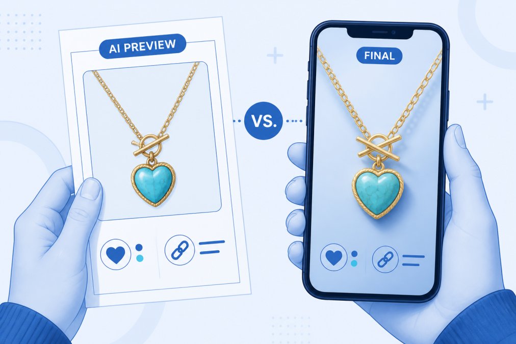
The most effective refinement happens when you compare the preview to your original brief. Does it solve the problem you set out to solve? Does it communicate what you intended? If not, identify the specific gap and address it in your next iteration.
Validating Design Against Brand Alignment
Before you approve a design for printing, validate it against your brand standards. This step prevents expensive mistakes, printing 100 units of apparel only to realize the design doesn't match your brand voice or visual identity.
Create a simple validation checklist. Does the design use your brand colors? Does it reflect your brand style (minimalist, playful, corporate, artistic)? Does it work across your intended applications, if it's for apparel, does it look good at 3 inches? If it's wall art, does it read clearly at 24 inches? Does the design feel consistent with other work you've created?
If you're creating designs for a brand or audience, add audience alignment to your checklist. Does this design appeal to your target audience? Does it communicate the right message? Does it stand out in your competitive space?
This validation step catches accuracy issues that preview software might miss. A design can look perfect on screen but fail when printed because the contrast isn't high enough, the colors don't match your expectations, or the composition doesn't translate well to the physical medium.
Building Consistency Into Your Design System
When you're creating multiple designs, for merchandise lines, wall art collections, or branded content, consistency becomes critical. A design system ensures every piece feels like part of a cohesive whole.
Start by documenting your design parameters. What colors define your brand? What typography styles do you use? What composition patterns work best for your audience? What level of detail is appropriate? Write these down explicitly. They become your design system foundation.
When you generate new designs, reference your documented system in your prompts. "Create a design using the brand color palette (navy, gold, cream), the geometric style established in previous work, and composition patterns that emphasize balance and negative space." This consistency constraint dramatically improves accuracy and reduces the number of iterations needed.
Use Vireous.Shop's design tools to build a component library. Save successful design elements, logos, color combinations, typography treatments, compositional patterns, and reuse them across projects. This creates visual continuity and speeds up the design process.
Review your generated designs as a collection, not individual pieces. Do they feel like they belong together? Do they share consistent visual language? If not, adjust your prompts to tighten the system. Consistency in visual design builds brand recognition and trust with your audience.
Common Mistakes That Reduce Preview Accuracy
Most accuracy problems stem from a few recurring mistakes. Recognizing these patterns helps you avoid them.
Vague prompts. "Make a cool design" produces unpredictable results. The AI model has no constraints to guide it. Specific prompts with clear constraints produce accurate results. Always describe exactly what you want.
Ignoring composition. Many creators focus on subject matter and forget about composition. Where should elements be positioned? What's the focal point? Should the design be symmetrical or asymmetrical? Composition matters as much as content.
Skipping the iterative process. Accepting the first acceptable design means missing opportunities for refinement. The second or third iteration is often significantly better than the first.
Not validating for print. Screen previews can mislead. Colors look different on fabric than on a monitor. Details that seem clear on screen can become muddy when printed. Always validate designs against the actual printing medium.
Inconsistent style direction. Changing your style requirements with each iteration confuses the AI model. Decide on a style direction early and stick with it through refinements.
Neglecting technical constraints. Screen printing, embroidery, vinyl cutting, and canvas printing all have different technical requirements. If you don't specify these constraints, your design might work perfectly on screen but fail in production.
Getting accurate AI design previews isn't about luck or magic. It's a learnable skill that improves with practice and systematic refinement. The creators who produce the best results, designs that preview accurately and print beautifully, use structured prompts, iterative workflows, and validation techniques consistently.
Prompt engineering best practices from Anthropic offer additional frameworks for crafting effective instructions to AI systems. The principles apply directly to design generation.
Vireous.Shop's DALL-E 3 integration makes this process accessible. You can generate designs, refine them iteratively, and validate them against your brand standards all within one platform. The same-day or next-day dispatch means you can move from preview to finished product quickly once you've approved your design.
Start with a clear prompt. Generate multiple variations. Evaluate them objectively. Refine based on what you learned. Validate against your brand and printing medium. This workflow produces accurate previews that translate into high-quality finished products. The time you invest in this process upfront saves time, money, and frustration later.
Frequently Asked Questions
Why are my AI design previews inaccurate compared to what I imagined?
Inaccurate previews usually stem from vague or overly complex prompts. AI models interpret language literally, so generic descriptions like 'cool design' produce unpredictable results. Use specific visual parameters: exact colors, layout structure, typography style, and reference images. Break complex ideas into smaller, clearer prompts. Test iteratively, each generation teaches the model what you want. Most accuracy issues resolve through prompt refinement and testing multiple versions before committing to production.
How do I write better prompts for AI design generators to get accurate previews?
Effective prompts combine specificity, structure, and constraints. Start with your core concept, then add visual details: dimensions, color palette, typography, mood, and reference style. Use phrases like 'minimalist,' 'vintage,' or 'modern geometric' to guide aesthetic direction. Include negative prompts, what you don't want. Test variations systematically. Document what works. Reference existing designs or images when possible. Break multi-element designs into separate prompts, then combine results. The more precise your language, the closer the preview matches your final vision.
Can AI design tools actually maintain brand consistency in previews?
Yes, but only with deliberate setup. Create a design system document that captures your brand's color codes, typography, spacing rules, and component library. Reference this system in every prompt. Use consistent naming conventions for design elements. Test previews against your brand guidelines before production. Some platforms offer design validation tools that check color contrast and accessibility automatically. Store successful prompts as templates for future projects. Consistency comes from treating your brand parameters as fixed inputs, not variables.
What should I do if the AI design preview doesn't match my final product?
Start by comparing the preview directly to the delivered product, lighting, angle, and screen settings can create false differences. If genuine discrepancies exist, document them with photos and contact support with specifics. Before reordering, refine your prompt based on what went wrong. Was the color off? Adjust RGB values. Did proportions look wrong? Specify exact dimensions. Use the refinement cycle to improve accuracy. Many issues stem from preview rendering differences, not production errors, test with a small order first, then scale up once you've validated the workflow.
This article was written using GrandRanker