

Table of Contents
- The Real Reason Your Custom AI Prints Look Blurry
- Why AI Images Are Raster, Not Vector
- Common Causes of Pixelation in AI Artwork
- How to Upscale AI Images for Print Without Losing Quality
- DPI Requirements for Custom Apparel and Wall Art
- File Formats and Color Settings That Keep Prints Sharp
- Quality Guarantee for Custom Prints: What to Check Before Ordering
- Final Checklist for Sharp AI Print Results
- Frequently Asked Questions
Last Updated: September 6, 2026
The Real Reason Your Custom AI Prints Look Blurry
Custom AI prints look blurry because the image file was created at screen resolution, not print resolution. When you generate artwork with an AI tool, the output is typically a raster image around 1024 x 1024 pixels, which looks sharp on a phone screen but falls apart when stretched across a 16 x 20 inch canvas. The gap between what the monitor displays and what the printer needs is the root cause of nearly every soft, pixelated print delivered to customers.
Creators design something stunning on their laptop, approve the proof, and then feel crushed when the physical product arrives looking fuzzy. The good news is that this problem is entirely preventable with the right preparation. Below, we'll walk through exactly why this happens, how to fix your files before ordering, and what to check so your custom AI prints come out razor sharp every time.
The technical term you need to understand is DPI, or dots per inch. A screen displays images at roughly 72 DPI, while commercial printers require 150 to 300 DPI for crisp results. That single difference explains most quality complaints.
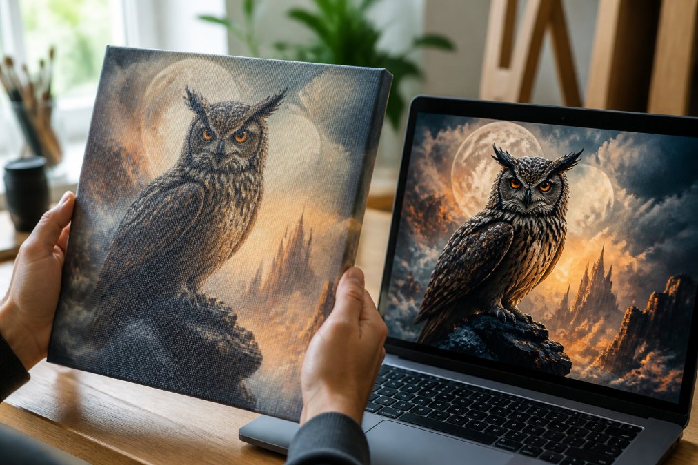
Screen Resolution vs. Print Resolution: The 72 DPI Trap
Most AI generators save images at 72 DPI because that's the standard for digital display. When that file is sent to a printer, the machine must interpolate, or guess, what additional pixels should look like. The result is a loss of fine detail, especially around edges and text.
Think of it this way: a 1024-pixel image printed at 10 inches wide gives you roughly 102 DPI. That's below the 150 DPI minimum most print shops accept. The larger the print, the more obvious the softness becomes.
Why AI Images Are Raster, Not Vector
AI-generated artwork is always raster, meaning it's made of a fixed grid of pixels. Vectors, by contrast, use mathematical curves that scale infinitely without losing quality. This distinction matters because raster images have a native resolution that cannot be improved, only approximated through upscaling.
How AI Generators Handle Resolution and Detail
When DALL-E or similar models generate an image, they produce a single fixed-size file. The model doesn't render extra detail on demand; it creates one interpretation at a set pixel dimension. This means the AI's creative output is locked at that resolution, and any enlargement beyond it requires software intervention.
Upscaling software uses interpolation algorithms to estimate new pixels between existing ones. Good upscalers add believable detail, while basic ones simply blur the image. This is why choosing the right upscaling method matters more than the original file size.
Common Causes of Pixelation in AI Artwork
Pixelation in AI prints usually traces back to one of four mistakes. The first is ordering a print size that exceeds the image's native resolution. A 1024 x 1024 image simply cannot fill a 24 x 36 inch poster at acceptable quality.
The second cause is saving files as JPG with heavy compression. Compression artifacts create blocky distortion in gradients and fine patterns. The third is skipping the upscaling step entirely, expecting the print shop to handle it. Many shops use basic automated scaling that produces mediocre results. Finally, over-sharpening an upscaled image creates harsh halos around edges, which reads as blur from a distance.
How to Upscale AI Images for Print Without Losing Quality
To upscale AI images for print successfully, follow this workflow. Start by exporting your AI artwork as a PNG file, which preserves detail without compression artifacts. Then use a dedicated upscaling tool to increase the resolution before you ever upload it to a print-on-demand service.
The target is straightforward: multiply your image dimensions until the DPI at your chosen print size reaches at least 200. For a 12 x 12 inch print, that means a 2400 x 2400 pixel file. Most upscalers can achieve this in a single pass.
Upscaling Tools That Actually Work
Dedicated AI upscalers produce noticeably better results than the built-in resize in photo editors. Tools like Topaz Gigapixel and Clipdrop Image Upscaler analyze the image content and generate plausible detail rather than simply stretching pixels. For most creators, a single upscale pass to double or quadruple the dimensions is sufficient.
Sharpening and Noise Reduction After Upscaling
After upscaling, apply gentle sharpening to restore edge definition. Most upscalers add a slight softness during interpolation, so a light unsharp mask helps. Avoid aggressive settings, which create unnatural halos. If your image has visible noise, particularly in dark areas, apply noise reduction before sharpening to prevent amplifying grain.
DPI Requirements for Custom Apparel and Wall Art
Different products demand different DPI requirements for custom apparel versus wall art. For canvas prints and framed posters, aim for 150 to 200 DPI at final size. Apparel printing, especially direct-to-garment, often needs 300 DPI because the fabric texture absorbs ink and softens detail.
A common mistake is using the same file for a phone case and a large canvas. The phone case may look perfect at 150 DPI, while the canvas reveals every flaw. Always check the recommended resolution for the specific product you're ordering, and upscale to meet the largest size you plan to purchase.
File Formats and Color Settings That Keep Prints Sharp
File format and color space play a larger role in perceived sharpness than most people realize. A technically sharp image can look soft if the colors are muddy or the format introduces artifacts. The most overlooked culprit is the color space conversion from RGB to CMYK, which can literally erase detail.
PNG vs. JPG for AI Artwork
PNG is the best format for AI artwork destined for print. It uses lossless compression, preserving every pixel of detail. JPG files use lossy compression that discards data, and the artifacts become visible in gradients, skies, and textured areas. If your AI generator only exports JPG, save a PNG copy before upscaling. This is a non-negotiable first step.
The RGB to CMYK Conversion Trap: Why Colors Look Blurry
AI generators produce images in the RGB color space, which is optimized for screens. Printers use CMYK ink. While most modern print-on-demand services handle this conversion automatically, the shift can dull vibrant colors. The deeper problem is that the RGB color gamut is larger than CMYK. This means certain bright, saturated colors, like neon greens and electric blues, cannot be reproduced with ink. When the conversion happens, the software must 'map' these out-of-gamut colors to the closest printable equivalent. This mapping process can cause a loss of tonal separation in adjacent areas. If you have a gradient from a bright cyan to a deep blue, the conversion might crush the intermediate tones into a single flat color, making the image look banded and soft.
This is not just a color issue; it's a detail issue. When colors that were distinct in RGB become identical in CMYK, the contrast between them disappears. The human eye perceives sharpness through contrast, so a loss of tonal separation directly translates to a perceived loss of sharpness.
How to Control the Conversion for Sharper Prints
Most print-on-demand services do not give you control over this conversion. They accept an RGB file and run a generic conversion profile. This is why some prints look 'muddy' or 'soft' even when the file is technically high-resolution.
To take control, you need to convert the file yourself in a photo editor like Adobe Photoshop. The process is straightforward:
-
Soft-Proof Your Image: In Photoshop, go to
View > Proof Setup > Working CMYK. This shows you a preview of what your image will look like when converted. You can then useImage > Adjustments > Hue/Saturationto pull back the vibrancy of out-of-gamut colors until they look acceptable in the proof. -
Convert to CMYK: Once you are happy with the soft-proof, go to
Image > Mode > CMYK Color. This permanently converts your file. - Check the Detail: After conversion, zoom in to 100% and inspect areas with fine detail or subtle gradients. If you see banding or a loss of edge contrast, you may need to apply a slight unsharp mask after the conversion to restore the perceived sharpness.
The Role of Color Profiles in Print Sharpness
Another layer is the color profile. When you save a PNG, it might be tagged with an sRGB profile. When you convert to CMYK, you must choose a destination profile. For US-based printing, a common profile is U.S. Web Coated (SWOP) v2. However, many modern digital printers are actually optimized for a different profile. If you are ordering from a service, ask them for their specific ICC profile. If they don't provide one, they are likely using a generic conversion, which is a gamble.
By mastering the RGB-to-CMYK conversion, you are not just fixing colors, you are preserving the tonal contrast that makes an image look sharp on paper. This is a unique angle that most guides ignore, but it is often the difference between a print that looks 'off' and one that looks professionally rendered.
Quality Guarantee for Custom Prints: What to Check Before Ordering
Before you place an order, verify three things to protect yourself from a blurry result. First, confirm the pixel dimensions of your file against the print size. Second, review the design proof at 100% zoom, not the full-page preview, which hides defects. Third, ask about the quality guarantee for custom prints offered by the shop.
Every custom canvas and framed print from Vireous.Shop includes a Money Back Guarantee. If the delivered product doesn't match the approved design quality, you're covered. We also dispatch same-day or next-day, so you won't wait weeks to discover an issue. The design preview you approve is what we print, giving you confidence before we commit ink to canvas.

Print Industry Standards for Image Resolution
Final Checklist for Sharp AI Print Results
Use this checklist before ordering any custom AI print:
- Export your AI artwork as a PNG file at the highest available resolution
- Upscale the image until it reaches 200 DPI at your target print size
- Apply light sharpening after upscaling to restore edge detail
- Convert colors to CMYK if your print provider supports direct upload
- Compare your file's pixel dimensions against the product's recommended specs
- Review the design proof at 100% zoom, checking edges and fine text
- Confirm the shop's quality guarantee covers print defects
| Problem | Cause | Fix |
|---|---|---|
| Soft, blurry print | Image below 150 DPI at final size | Upscale to 200+ DPI before ordering |
| Blocky pixelation | Native resolution exceeded | Reduce print size or upscale with AI tool |
| Muddy colors | RGB to CMYK shift | Request color-managed proof or upload CMYK |
| Harsh edges | Over-sharpening after upscale | Use gentle unsharp mask settings |
The gap between screen sharpness and print sharpness catches everyone at least once. Now you know the technical reasons behind it and the exact steps to prevent it. When you're ready to turn your AI creation into something physical, Adobe's Guide to Image Resolution offers deeper technical detail on pixel dimensions and output quality.
For a seamless experience, upload your properly prepared files to a platform built for AI-generated art. Vireous.Shop integrates with OpenAI's DALL-E 3 API, letting you generate designs directly and order them printed on canvas, framed posters, or apparel with same-day dispatch. The Interactive Advertising Bureau's Digital Video Guidelines may not cover print, but the principle holds: match your source quality to your output medium.
Frequently Asked Questions
Why do AI-generated images look blurry when printed?
AI generators create images at a fixed resolution, usually 1024x1024 pixels. That looks sharp on a screen but equals only about 72 DPI when printed at a large size. Printing stretches those pixels across physical space, which creates softness and blur. The issue is not the AI model itself but the gap between screen resolution and the DPI requirements for custom apparel or large canvas prints.
What is the minimum DPI required for high-quality custom prints?
For custom apparel and wall art, aim for 300 DPI at the final printed size. This means a 12x12 inch print needs an image of at least 3600x3600 pixels. Most AI generators output around 1024x1024 pixels, so you will need to upscale AI images for print to meet that standard. Lower DPI values around 150 can work for large-format posters viewed from a distance, but 300 DPI is the safe benchmark.
How can I upscale AI images without losing detail?
Use a dedicated AI upscaling tool rather than simply stretching the image in photo editing software. Tools like Topaz Gigapixel AI, ESRGAN-based apps, or the upscaler built into Photoshop analyze the image and add detail rather than just blurring pixels. After upscaling, apply subtle sharpening and noise reduction. Check the result at 100% zoom to confirm edges look clean before you order a custom AI print.
Why do colors look different on my screen compared to the final print?
Screens display colors in RGB (red, green, blue) using light, while printers use CMYK (cyan, magenta, yellow, black) ink. This color space difference means some bright screen tones cannot be reproduced in print. Also, uncalibrated monitors can show inaccurate colors. Convert your file to CMYK before sending it to a print service and request a physical proof if color accuracy matters for your custom AI print.
Getting sharp custom AI prints comes down to preparation, not luck. Upscale your files, choose the right format, and verify your DPI before ordering. Vireous.Shop combines DALL-E 3 integration, made-to-order printing, and a Money Back Guarantee so your vision translates exactly as intended. Get started with Vireous.Shop and create your own AI-generated canvas art print in six sizes, from OpenAI imports to fully customized designs.