

Table of Contents
- Why AI Images Look Blurry or Pixelated in Print
- What You'll Need Before You Start
- Step 1: Check Your Image Resolution and Aspect Ratio
- How to Fix Pixelated AI Art with Upscaling
- Best DPI for Wall Art and Large-Format Prints
- Color Space Conversion: RGB to CMYK for Print
- Step 2: Sharpen, Reduce Noise, and Prepare Print-Ready Files
- Common Mistakes That Ruin Print Quality
- Frequently Asked Questions
Last Updated: September 10, 2026
Why AI Images Look Blurry or Pixelated in Print
The image on your screen looks sharp, but the print comes back soft, blocky, or fuzzy, the most common complaint from creators printing AI-generated art, and it traces back to one misunderstanding about AI image quality.
AI image quality describes how much real detail a file contains, not how good it looks on a monitor. A screen displays roughly 72 to 96 pixels per inch, so a 1024-pixel-wide image looks fine on a phone (developer.apple.com). A printer lays down ink at 300 dots per inch, so that same file must stretch across a much larger physical space, and when it can't, the software invents pixels to fill the gap, producing the blur or pixelation you see.
This guide walks through the full workflow, from checking your source file to exporting a print-ready document.
Resolution vs. DPI vs. PPI: What Actually Matters
Resolution is the total pixel count in a file, expressed as width by height. PPI (pixels per inch) describes how densely those pixels are packed when printed. DPI (dots per inch) refers to how many ink droplets a printer fires per inch, a hardware spec, not a property of your file.
For print work, PPI is the number you control. A common target is 300 PPI at final print size, though larger wall art holds up at lower values because viewers stand farther back. The formula: divide pixel dimensions by your target PPI to get maximum print size in inches.
| Term | What it describes | Where it lives | What you control |
|---|---|---|---|
| Resolution | Total pixel count (width x height) | The image file | Yes, via upscaling |
| PPI | Pixel density at print size | File plus print dimensions | Yes, by resizing |
| DPI | Ink droplets per inch | The printer hardware | No |
What You'll Need Before You Start
Gather these before touching a single slider. Skipping this step is how most people end up redoing the work twice.
- Your original AI-generated file at its highest available resolution
- An upscaling tool (dedicated AI upscaler or an editor with super-resolution)
- An image editor that supports CMYK conversion and sharpening
- The exact print dimensions and paper type from your printer or vendor
- A color profile reference for the target output
Step 1: Check Your Image Resolution and Aspect Ratio
Open the file properties, note the pixel dimensions, then divide each by 300 to see the largest print you can make at full quality.
A 2048 x 2048 file tops out at roughly 6.8 x 6.8 inches at 300 PPI, a small framed print (adobe.com). For a 24 x 36 inch canvas you need closer to 7200 x 10800 pixels, so upscaling is unavoidable.
Aspect ratio matters just as much. AI generators often output square files, but standard frame sizes are 2:3, 4:5, or 3:2. Cropping a square to fit a rectangular frame cuts pixels you may not be able to spare, so decide the final aspect ratio before you upscale.
How to Fix Pixelated AI Art with Upscaling
Upscaling increases pixel dimensions while reconstructing detail rather than simply stretching existing pixels. Traditional interpolation, bicubic, bilinear, Lanczos, averages neighboring pixels and produces soft, mushy results. Modern AI upscalers analyze patterns and generate plausible detail to fill the gaps.
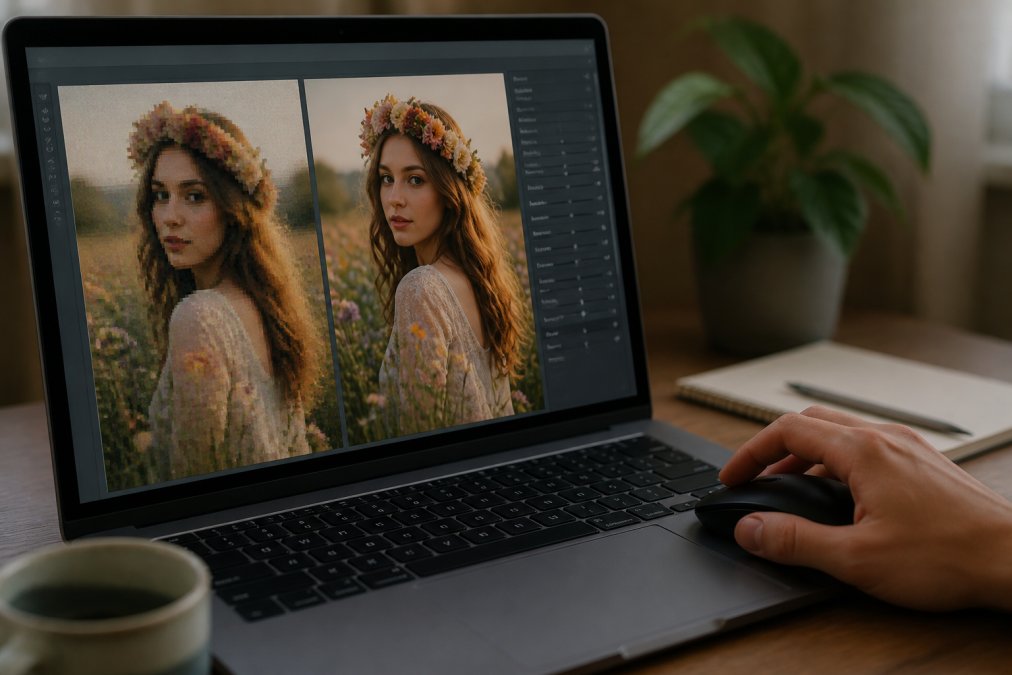
That difference matters for print: a file that looks acceptable on screen can fall apart the moment a printer resolves it at 300 PPI. But the same mechanism that makes AI upscaling powerful also makes it dangerous for print.
AI Image Upscaling Tools Compared
Upscaling tools fall into three categories, and the right pick depends on how much control you want versus how much time you have.
| Tool Type | Best For | Control Level | Typical Workflow |
|---|---|---|---|
| Dedicated AI upscaler | Fast batch jobs, large canvases | Low | Upload, pick scale, download |
| Editor with super-resolution | Fine-tuning after upscale | High | Upscale, then mask and correct |
| Generative re-render | Recovering lost texture | Medium | Re-prompt at higher resolution |
For most creators printing wall art, a dedicated upscaler handles the bulk of the work, then an editor pass cleans up the result. Try the generative re-render route when the original file is so small that upscaling produces obvious smoothing.
Artifact Removal vs. Detail Hallucination
Here's the trade-off nobody warns you about. AI upscalers don't recover real detail, they predict it. That predicted detail is called hallucination, and it can invent texture that wasn't in the original.
Sometimes that's exactly what you want: a flat sky gains subtle grain, a smooth surface gains believable variation. Other times it backfires. Faces gain strange symmetry, text becomes gibberish, and fine patterns turn into noise.
Artifact removal runs the opposite direction: it smooths compression blocks and banding but can also erase legitimate texture. The practical approach is to upscale first, inspect at 100% zoom for hallucinated detail, then apply targeted noise reduction only where artifacts actually appear.
How to Spot AI Artifacts Before They Hit Ink
The screen hides artifacts that ink exposes. A monitor at 72 to 96 PPI blends small errors together; a printer at 300 DPI resolves them individually. That's why an upscale that looks flawless on your display can arrive with visible defects on paper.
Run this inspection pass at 100% zoom before you export. Five artifact types account for most ruined prints:
- Waxy skin and plastic faces. AI upscalers over-smooth pores and fine wrinkles, then add a uniform sheen. On screen it reads as "clean." On matte paper it reads as a mannequin. Fix by masking the face and reintroducing subtle grain from the original at low opacity.
- Gibberish text and pseudo-symbols. Any lettering in the source, signage, book spines, logos in the background, gets reinterpreted as plausible-looking nonsense. Zoom to 200% and read every character. If it isn't legible, crop it out or paint over it before printing.
- Repeating micro-patterns. Fine textures like fabric weave, foliage, or brick can collapse into a tiled, wallpaper-like repeat. Look for the same 8-to-16-pixel cluster appearing in a grid. Fix with a light content-aware fill over the worst patches.
- Edge halos and ringing. Sharpening applied before or during upscaling leaves a bright outline along high-contrast edges. Against a dark background this becomes a glowing rim in print. Back off sharpening and re-apply after resizing.
- Banding in gradients. Skies, fog, and soft shadows can develop visible steps where the upscaler quantized smooth transitions. A tiny amount of noise (1-2% monochromatic) breaks the bands without adding visible grain.
Batch Processing Workflows for Print Shops
If you're printing one piece, the inspection pass above is enough. For a series, a gallery run, a product drop, a wholesale order, file-by-file doesn't scale, so professional print shops automate the pipeline.
The standard batch workflow runs in this order, and the order matters:
- Ingest and log. Copy originals to a working folder, never edit in place. Record pixel dimensions and color space for each file.
- Upscale in bulk. Most dedicated upscalers accept a folder or a queue. Set one scale factor for the whole batch so the series stays visually consistent.
- Automated artifact triage. Use an editor action or script to flag files with high-frequency noise, extreme edge contrast, or detected text regions. These get manual review; the rest pass through.
- Color conversion. Apply the same output profile to every file in one pass. Mixing profiles across a series is the fastest way to get a mismatched set.
- Output sharpening and export. One sharpening preset per paper type, one export format (TIFF for print), one naming convention.
In Adobe Photoshop, this is a recorded Action run through File > Automate > Batch, or a Droplet for drag-and-drop. In Affinity Photo, it's a Macro applied via File > New Batch Job. Free options like ImageMagick handle resize, color profile assignment, and format conversion from the command line, though they can't replicate AI upscaling or content-aware artifact removal.
The payoff isn't just speed. Consistency across a series matters more than squeezing the last bit of quality out of any single image, and a batch pipeline enforces that by removing per-file judgment calls.
Build the batch pipeline once, test it on three files, then run the full series. A mistake in step 4 propagates to every file in the queue, so validate the color conversion on a proof print before committing the whole run.
Best DPI for Wall Art and Large-Format Prints
The best DPI for wall art depends on viewing distance, not a single universal number. A print viewed from arm's length needs more pixel density than one viewed from across a room.
A practical rule: 300 PPI for anything handheld or viewed up close, 150 PPI for framed prints hung at eye level, and 100 PPI or lower for large-format pieces viewed from several feet away. A 40-inch canvas at 100 PPI needs 4000 pixels across, far more achievable than the 12000 pixels a 300 PPI target would demand.
| Print Type | Viewing Distance | Target PPI |
|---|---|---|
| Small framed print | Close, handheld | 300 |
| Standard wall art | Eye level, a few feet | 150 |
| Large-format canvas | Several feet back | 100 |
Color Space Conversion: RGB to CMYK for Print
Screens emit light in RGB. Printers lay down ink in CMYK. That conversion changes how colors appear, and it's the step most creators skip until a proof comes back looking dull.
Saturated blues and bright greens are the usual casualties. Colors that glow on a monitor fall outside the CMYK gamut and get pulled toward a flatter, muddier version. Convert to CMYK yourself, in your editor, so you can see and correct the shift before the file reaches a printer.
The International Color Consortium's profile documentation explains how color profiles manage this translation. Assign the correct output profile for your paper, then soft-proof to preview how the ink will actually look.
Always convert to CMYK and soft-proof before exporting. If you send an RGB file to a commercial printer, their automated conversion decides how your colors shift, and you lose all control over the result.
Step 2: Sharpen, Reduce Noise, and Prepare Print-Ready Files
Sharpening restores the edge definition that upscaling and resizing soften. Apply it last, after all resizing and color conversion, because every earlier step changes what the pixels need.
Use output sharpening tuned to your print size. Over-sharpening creates halos around edges that are invisible on screen but obvious in ink. Start conservative, view at 100%, and back off if edges start to glow.
Then handle noise. AI-generated images often carry subtle grain or banding in gradients. Apply noise reduction selectively, masked to flat areas like skies and backgrounds, and leave textured regions untouched.
Choosing the Right File Format: PNG vs. TIFF vs. JPEG
The export format determines how much quality survives the trip to the printer.
| Format | Best For | Compression | Print Suitability |
|---|---|---|---|
| PNG | Graphics, flat color, logos | Lossless | Good, but large files |
| TIFF | Professional print output | Lossless | Best for print |
| JPEG | Quick sharing, web | Lossy | Acceptable at max quality only |
TIFF is the safest choice for print because it preserves every pixel without compression artifacts. PNG works well when file size is a concern. JPEG is fine only at maximum quality settings, since every re-save degrades the file further.
Common Mistakes That Ruin Print Quality
The same handful of errors show up again and again, and each one is avoidable.
- Upscaling a file that was already saved as a low-quality JPEG, which locks in compression artifacts permanently
- Forgetting to add bleed and crop marks, so the trim eats into your composition
- Sharpening before resizing, then sharpening again, which compounds halos
- Ignoring paper texture, which changes how much fine detail actually reads in the final print
- Exporting at screen resolution and assuming the printer will sort it out
- Choosing paper stock after the file is finalized, when the stock should drive the sharpening and noise decisions
How Paper Stock Changes What Your AI Detail Actually Looks Like
Paper isn't a neutral surface. Every sheet has a texture, coating, and reflectance that interacts with the pixels you send it. The same AI-upscaled file can look crisp on one stock and muddy on another, and the difference is predictable.
The key variable is surface roughness, how much the paper's top layer scatters ink before it dries. Smoother surfaces hold fine detail; rougher surfaces diffuse it.
| Paper Finish | Surface | Detail Retention | Best For |
|---|---|---|---|
| Glossy photo | Very smooth, coated | Highest | Crisp linework, high-contrast AI art, product shots |
| Satin / luster | Smooth, lightly textured | High | Portraits, painterly AI art with fine gradients |
| Matte coated | Smooth, no sheen | High | Gallery prints, low-glare display, fine detail |
| Matte uncoated | Slightly rough | Medium | Atmospheric, textured, painterly work |
| Fine art textured (rag, watercolor) | Rough, fibrous | Low to medium | Loose, impressionistic AI art; hides artifacts |
| Canvas | Woven, dimensional | Low | Large-format pieces viewed from a distance |
Here's the mechanism. A glossy coated sheet sits ink on top of the surface, so a 2-pixel edge stays a 2-pixel edge. An uncoated or textured sheet wicks ink slightly outward, softening that edge by a pixel or more. On a 300 PPI file, one pixel is about 1/300 of an inch, small on its own, but across thousands of edges it's the difference between "sharp" and "soft."
That has three practical consequences for AI art:
1. Textured paper hides AI artifacts. Hallucinated micro-patterns, waxy skin, and faint banding all get absorbed by the paper's own texture. If your upscale has minor defects you can't fully remove, a fine-art textured stock is a legitimate fix, not a workaround.
2. Smooth paper exposes AI artifacts. Glossy and satin stocks resolve every pixel, including the ones the upscaler invented. If you're printing on glossy, run the artifact inspection pass described earlier at 200% zoom, not 100%.
3. Sharpening should be tuned to the stock, not the file. A preset that looks right on glossy will look over-sharpened on textured paper, because the paper adds its own edge softening. Reduce output sharpening by roughly a third when moving from glossy to a textured fine-art sheet, and proof before committing a series.
Matching AI Art Style to Paper Stock
The stock should match the intent of the image, not just its resolution.
- Crisp, graphic, high-contrast AI art, vector-style illustrations, geometric compositions, product mockups, belongs on glossy or satin. The paper's smoothness reinforces the image's own precision.
- Painterly, atmospheric, or impressionistic AI art, soft landscapes, dreamlike portraits, textured abstracts, belongs on matte uncoated or fine-art textured stock. The paper's grain becomes part of the piece.
- Photorealistic AI portraits, satin or matte coated. Glossy can make skin look plasticky, which compounds the waxy-skin artifact AI upscalers already introduce.
- Large-format canvas, canvas weave is coarse enough that 150 PPI is often sufficient. Don't pay for a 300 PPI upscale you can't see.
Decide the paper stock before you finalize the file. Sharpening, noise reduction, and even your target PPI all depend on how much texture the paper will add. Choosing stock last means redoing the file.
Frequently Asked Questions
How to increase the quality of an AI image?
Start by checking resolution: AI images are often 1024x1024 pixels, which is too small for large prints. Use an AI upscaling tool to increase pixel dimensions, then sharpen and reduce noise. Convert to CMYK for print, and save as TIFF or PNG. For best results, aim for 300 DPI at final print size.
What is the minimum DPI for high-quality wall art prints?
For wall art, 150 DPI is the minimum for large-format prints viewed from a distance, but 300 DPI is ideal for smaller prints viewed up close. DPI (dots per inch) determines pixel density. If your AI image is 1024x1024 pixels, it can print at 300 DPI up to about 3.4x3.4 inches. For a 16x20 inch print, you need at least 2400x3000 pixels for 150 DPI.
Why do AI images look blurry when printed?
AI images look blurry in print because they lack sufficient resolution for the print size. Most AI generators output at 72-96 DPI screen resolution, but print requires 150-300 DPI. Upscaling with AI tools adds pixels intelligently, but without it, the printer stretches existing pixels, causing blur. Also, missing CMYK conversion can make colors look dull or off.
Can I use AI upscaling tools to fix pixelated AI art?
Yes, AI upscaling tools like Topaz Gigapixel or free options like Upscayl can increase resolution by 2x to 6x while reducing artifacts. They use machine learning to predict missing pixels, which works well for AI art. After upscaling, apply sharpening and noise reduction. For print-ready files, always check the final DPI at your intended print size.