Last Updated: November 14, 2026
Quick Summary
The best paper for printing AI art depends on the style of the artwork. Matte paper suits painterly and textured designs, semi-gloss paper makes vivid colors pop, and smooth matte keeps fine line art crisp. Heavier stock around 200 gsm feels substantial on the wall, while glossy photo paper suits photographic-style images.
- Matte paper removes glare, which makes the image read clearly under room lighting.
- Semi-gloss coated paper adds a light sheen that makes saturated colors pop.
- Our framed posters use 200 gsm semi-gloss coated paper with a clear Perspex cover.
- Check your printer's maximum supported paper weight before buying heavy stock.
- Print a small test strip at final size and check it under the lighting where it will hang.
Which paper suits your AI art?Vireous.Shop prints AI designs on framed, FSC-certified paper, ready to hang.
Browse Framed AI Art
Table of Contents
How We Chose These Paper Types for AI Art
Printing AI art well comes down to one choice that people often skip: the paper. The same image can look rich and luminous on one sheet and flat or muddy on another, so getting printing AI art right starts with the surface you choose. The right paper depends on the artwork, the room it will hang in, and how much detail you want to keep.
We organized this list around four questions: what finish suits the style, how the surface handles texture and color, how heavy the paper feels, and whether it suits your intended use. Each entry below answers those questions in plain terms. Where a product from our catalog matches a paper type, we link to it so you can see it framed and ready to hang.
Quick Comparison: Paper Finishes and Weights at a Glance
| Paper Type |
Finish |
Typical Weight |
Best For |
| Matte fine-art paper |
Soft, non-reflective |
Medium to heavy |
Painterly and textured AI styles |
| Semi-gloss coated paper |
Light sheen |
Medium |
Vivid, saturated colors |
| Smooth matte paper |
Flat, even surface |
Medium |
Detailed, sharp illustrations |
| Textured cotton rag |
Visible tooth |
Heavy |
Archival, gallery-style pieces |
| Glossy photo paper |
High reflective shine |
Light to medium |
Photographic-style AI images |
Weight and finish interact. A heavier sheet feels more substantial on the wall, while a lighter sheet suits smaller prints and gifts.
Matte Paper for Art Prints: When a Soft Surface Works Best
Matte paper is the most forgiving choice for AI art. It removes glare, so the image reads clearly under room lighting, and it hides fingerprints better than gloss. For painterly or textured styles, a matte surface lets brushwork-like detail stand out rather than being washed out by reflection.
The trade-off is contrast. Deep blacks can look slightly softer on matte stock than on gloss, so avoid matte paper for high-contrast neon or chrome-style designs. A good test print on a small size will show you whether the depth you want survives the finish. For a side-by-side look at other surfaces, see paper types for AI wall decor.
The Mars and Venus as Robots in the Style Of Botticelli print is available in our catalog as a framed print on 200 gsm semi-gloss coated paper.
Semi-Gloss Paper for Vivid, Colorful AI Artwork
Semi-gloss paper sits between matte and high gloss. It adds a light sheen that makes saturated colors pop without the glare that full gloss creates. For bold, colorful AI pieces, this is often the sweet spot.
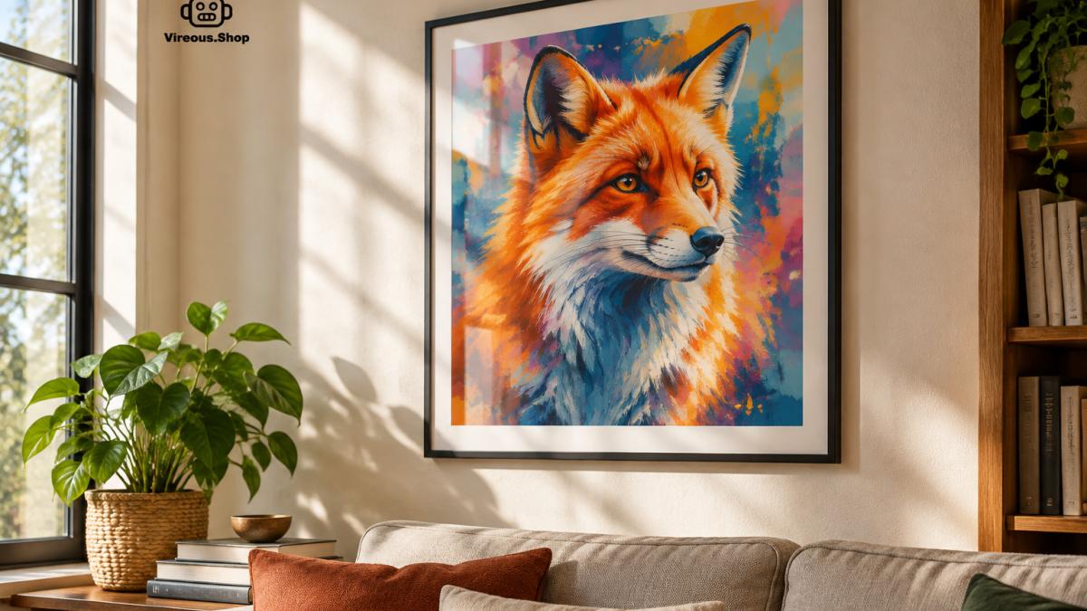 Framed AI-generated colorful poster hanging on a living room wall in warm natural light with a subtle paper sheen
Our framed posters use 200 gsm semi-gloss coated paper with a clear Perspex insert cover. The Leaders Must be Human Digital Art is one of the designs available in this format.
Watch out: semi-gloss shows reflections under direct lamps, so position the print away from a window or a spotlight that hits it straight on.
Best Paper Weight for Art Prints and How Thickness Affects Display
Paper weight is the second-biggest lever after finish, and it is the one most often reduced to a single number. Paper weight is usually expressed in gsm (grams per square meter) or in lb bond and lb text. The two scales do not convert cleanly, so always compare like with like.
A practical working range for AI art prints:
-
180-250 gsm: The weight used in our framed posters, which use 200 gsm semi-gloss coated stock.
Thickness (caliper) is not the same as weight, because two sheets can weigh the same and feel different.
Watch out: A heavier sheet is not automatically better. If your printer's maximum supported weight is below the paper you buy, the sheet can misfeed, smear, or jam, and coated heavyweight stock is the most common culprit. Because paper weight is only one part of a print’s longevity, DE LA Gallery offers a useful next step in considering how archival choices shape fine art photography prints.
Matching Paper to AI-Art Style and Intended Use
Most guides stop at "match the paper to the art." A more useful decision guide maps both the style and the destination:
| AI-art style |
Finish |
Weight |
Wall art |
Portfolio |
Gift |
| Photorealistic |
Semi-gloss or glossy |
200-260 gsm |
Semi-gloss, framed |
Glossy, sleeved |
Semi-gloss, small size |
| Painterly / classical |
Matte or textured |
200-300 gsm |
Textured matte |
Matte, uncoated |
Matte, medium |
| Anime / line art |
Smooth matte |
180-250 gsm |
Smooth matte |
Smooth matte |
Smooth matte |
| Abstract / bold color |
Semi-gloss |
200-260 gsm |
Semi-gloss |
Semi-gloss |
Semi-gloss |
| Dark / moody |
Matte |
200-300 gsm |
Matte, low-glare |
Matte |
Matte |
Weight
Photorealistic 200-260 gsm
Painterly / classical 200-300 gsm
Anime / line art 180-250 gsm
Abstract / bold color 200-260 gsm
Best Paper for Digital Art Prints: Matching Paper to Your AI Art Style
The best paper depends on the style of the artwork. A quick guide:
-
Painterly and classical AI styles: matte or textured paper, which echoes canvas and brushwork.
-
Bold, graphic, or colorful designs: semi-gloss, for saturation without glare.
-
Detailed illustrations and line art: smooth matte, so fine lines stay crisp.
-
Photographic AI images: glossy or semi-gloss, for sharpness and tonal range.
-
Dark or moody pieces: matte to avoid reflections hiding shadows, or semi-gloss if you need deeper blacks.
Our catalog includes a range of styles, from the Vermeer-inspired Sea Otter With Pearl Earring to the Van Gogh-inspired Sunflowers With An Angel Above, all in the same framed format.
How to Print AI Art on Your Chosen Paper
Home printing is where most AI-art prints go wrong, and almost always for one of four reasons: the printer cannot feed the sheet, the ink is wrong for the coating, the sheet is loaded on the wrong side, or the color profile does not match the paper. Address those four before you buy a large pack.
Printer, Ink, and Paper Compatibility
Check three specifications before you commit to a paper:
-
Maximum paper weight and thickness. Consumer inkjet printers commonly list a maximum in gsm and sometimes in mils. If the paper exceeds it, the sheet may misfeed or the print head may strike the surface. Coated and cotton-rag stocks are the usual offenders.
-
Ink type. Dye-based inks sit on the surface and look vivid on coated and glossy stock but fade faster; pigment-based inks are more archival and pair better with matte and fine-art papers. Mixing a dye printer with a heavy matte fine-art sheet often produces a dull, flat result.
-
Printable side. Coated and photo papers have a treated side and a back. Loading the wrong side gives a washed-out or smeared print. Most manufacturers mark the printable side with a small logo, arrow, or corner cut on the back.
Also check the manufacturer's ICC profile for that specific paper. Profiles are printer-and-paper specific; a profile for one brand's matte sheet will not be correct for another's.
Proofing and Color-Management Workflow
A short proofing loop saves paper and ink:
-
Soft-proof on screen first. In your image editor, enable the paper's ICC profile in the proofing view so you see an approximation of how the paper white and surface will shift colors before you print.
-
Print a small test strip. Use a crop of the image at the final size, not a scaled-down whole image, so detail and gradient behavior are realistic.
-
Evaluate under the final lighting. A print that looks right near a window can look muddy under a warm lamp. Check it where it will hang.
-
Adjust and re-proof. If blacks look lifted on matte, a small contrast or black-point adjustment in the file often fixes it without changing paper.
Paper white matters here. A bright white sheet makes cool colors look cooler and can make warm skin tones look slightly pink; a warmer, natural-white sheet shifts everything warmer. Surface finish changes perceived contrast too, the same file will look punchier on semi-gloss than on matte.
Cost and Value Trade-offs
Approximate cost per print rises sharply with weight and archival quality. Everyday matte paper is the cheapest per sheet and fine for proofs and casual prints. Heavyweight art paper costs more but reduces curl and looks better framed. Archival cotton rag costs the most and is worth it only when the print is meant to last decades. The practical rule most print shops follow: proof on the cheap paper, print the final on the good paper.
Sustainability and Material Choices
Recycled and responsibly sourced papers are widely available, and FSC-certified stocks are common in framed poster production.
Watch out: Let prints dry fully before framing, coated and photo papers can remain tacky for several hours, and framing too soon can transfer ink to the glass or cover.
Choose Your Paper and Order Your AI Art Print
Choosing the right paper turns a good AI image into a piece you want to keep looking at. Start with the style of your artwork, then decide how much shine and weight you want, and test before you commit to a large size.
If you would like a finished piece rather than a home print, browse our framed AI art collection at Vireous.Shop. Each poster is printed on FSC-certified paper, comes with a hand-crafted wooden frame, and is ready for hanging. Pick the design that fits your space and see the paper finish for yourself.
Frequently Asked Questions
What type of paper is best for printing art prints?
Our framed posters use 200 gsm semi-gloss coated paper, which gives vivid colors and fine detail. The right choice depends on the artwork's style and where the print will hang.
Is matte or glossy paper better for AI art prints?
It depends on the image. Matte paper softens contrast and hides glare, which suits painterly, muted, or texture-heavy AI art, such as images imitating classical oil painting. Glossy and semi-gloss paper deliver higher color saturation and sharper detail, which suits bold, neon, or high-contrast digital designs. Print a small test sample of your image on each finish under your room's lighting before committing to a full order.
What paper weight should I use for art prints?
Our framed posters use a 200 gsm semi-gloss coated paper. Weight affects how the print feels and how flat it hangs, so match it to whether the piece will be framed behind glass or displayed loose.
Can I print AI art on canvas or fine art paper?
Yes. Canvas gives a gallery-wrapped look and a textured surface that suits brushwork-style AI images. Fine art paper, especially cotton rag or alpha-cellulose stocks, offers a softer matte look with good tonal depth. Both work well for collectors, though canvas tends to show less fine detail than smooth paper. Check the printer's available materials and the ink used before choosing, since compatibility affects color accuracy.