

Table of Contents
- What Is an AI Mood Board Generator?
- AI Mood Board Prompt Engineering: Writing Prompts That Work
- Best AI Image Generators for Designers in 2026
- Step-by-Step: Creating Your First AI Mood Board
- How to Use AI for Interior Design Concepts
- Integrating AI Visuals into Your Design Workflow
- Ethical Considerations and Copyright for AI-Generated Art
- Conclusion
- Frequently Asked Questions
Last Updated: September 22, 2026
What Is an AI Mood Board Generator?
Learning how to create mood boards with AI tools starts with the generator itself, which turns written descriptions into original images you can arrange as a visual reference. Instead of hunting stock photos for hours, you type what you want and the tool builds it.
How AI Mood Board Tools Differ from Traditional Templates
Traditional templates give you a fixed grid and a stock library. AI tools generate the image itself, so every visual is unique to your project, you can match a specific design aesthetic instead of settling, iterate in minutes rather than days, and explore directions you could not have searched for. A common mistake is treating AI output as final art, it is raw material for creative direction.
AI Mood Board Prompt Engineering: Writing Prompts That Work
AI mood board prompt engineering means writing image descriptions that specify subject, style, lighting, color, and composition in one pass. A good prompt reads like a creative brief, not a search query.
- Subject: a reading corner with a linen armchair
- Style: mid-century, warm minimalism
- Lighting: late afternoon sun through sheer curtains
- Palette: cream, walnut, muted sage
- Composition: wide shot, low camera angle
- Mood: calm, lived-in, quiet
Prompt Structures for Specific Design Styles
Different design styles need different prompt skeletons. These hold up in practice:
- Mid-century modern: "1950s interior, walnut and teak, tapered legs, mustard and teal accents, soft film grain"
- Scandinavian: "light oak, white walls, natural wool textures, diffused daylight, minimal clutter"
- Industrial: "exposed brick, blackened steel, concrete floor, hard directional light, cool gray palette"
- Bohemian: "layered textiles, rattan, dried botanicals, warm ochre and terracotta, soft golden hour light"
- Editorial fashion: "high-contrast studio lighting, bold color blocking, sharp shadows, magazine cover framing"
Best AI Image Generators for Designers in 2026
There is no single best tool, the right pick depends on what you need the image for.
Here is how the main categories break down:
| Tool Type | Strength | Weakness | Best For |
|---|---|---|---|
| Text-to-image models | Fast concepting | Loose control over layout | Early conceptualization |
| Image-to-image tools | Keeps your style reference | Needs a source image | Design iteration |
| Vector and layout tools | Editable output | Weaker photorealism | Design system work |
| Print-on-demand platforms | Finished physical product | Not a design editor | Turning art into decor |
Step-by-Step: Creating Your First AI Mood Board
Total Time: 45 to 60 minutes for learning how to create mood boards with AI tools Difficulty: Beginner
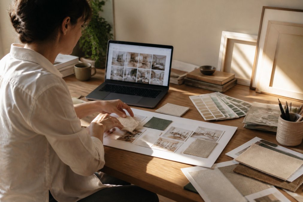
What You'll Need:
- A text-to-image tool
- A board tool or a blank canvas
- Your project brief or a rough idea
- 20 to 30 minutes for the first generation pass
Prompt Modifiers by Design Discipline
Generic prompt advice breaks down between disciplines, the modifiers that matter for interior design are not the ones that matter for fashion or graphic design. Here is a working cheat sheet.
Interior design modifiers:
- Materials: light oak, walnut, travertine, bouclé, unlacquered brass
- Lighting: diffused daylight, warm lamp glow, hard directional sun
- Camera: wide-angle interior shot, eye-level, 24mm feel
- Avoid: fisheye distortion, HDR real-estate look, oversaturated wood tones
Graphic design modifiers:
- Style: Swiss International Style, Bauhaus, brutalist web, risograph
- Composition: grid-based, asymmetric balance, generous negative space
- Color: duotone, limited palette, high-contrast accent
- Avoid: drop shadows, beveled edges, clip-art gradients
Fashion modifiers:
- Lighting: high-contrast studio, softbox beauty light, editorial rim light
- Framing: full-body, three-quarter crop, magazine cover composition
- Texture: silk drape, raw denim, matte leather, sheer organza
- Avoid: mannequin look, catalog flat lighting, plastic skin
Product and packaging modifiers:
- Setup: seamless backdrop, floating product, styled flat lay
- Lighting: soft top light, gradient falloff, specular highlight control
- Finish: matte, satin, brushed metal, frosted glass
- Avoid: harsh reflections, cluttered props, busy backgrounds
Using Style References and Image-to-Image Generation
Image-to-image lets you feed an existing image in and generate variations, which is how you keep design consistency across a whole board.
The workflow is simple:
- Pick your strongest generated image
- Upload it as the style reference
- Lower the variation strength for subtle changes, raise it for bolder ones
- Generate 5 to 8 variations
- Keep the ones that still read as the same family
Human-in-the-Loop Editing: Fixing the AI Look
Raw AI output has tells: waxy skin, wrong hands, wobbling lines, smeared textures. A short manual pass fixes 90 percent of these faster than re-prompting:
- Crop tight. Many AI artifacts live at the edges. Cropping in is often the fastest fix.
- Desaturate slightly. A 5 to 10 percent saturation pull removes the plastic sheen without killing the palette.
- Add grain or noise. A light film grain layer breaks up the over-smooth AI surface and reads as intentional.
- Fix geometry by hand. Straighten verticals in architectural shots and clean up obvious structural errors.
- Replace one element. Swap a single object for a real photo or a hand-drawn mark. One human element changes how the whole image reads.
How to Use AI for Interior Design Concepts
How to use AI for interior design concepts comes down to one rule: generate room by room, not whole-house. A single prompt for an entire home produces mush.
Work in this order:
Small Folding Bluetooth Keyboard →
- Palette first. Generate color studies before furniture.
- Then materials. Wood, stone, textile, metal, glass.
- Then one hero room. Living room or kitchen, wide shot.
- Then supporting rooms. Match the palette you already locked.
Integrating AI Visuals into Your Design Workflow
The real test of AI is not image quality but whether the output survives contact with your design workflow, and whether you can legally use it when the project ships.
A workflow that works:
- Generate in the AI tool
- Export at the highest resolution available
- Bring into your design software for cleanup
- Fix edges, remove artifacts, adjust layout composition
- Save into a shared collaborative workspace
- Log the prompt that produced it
Moving from AI Mood Board to Production Software
An AI mood board is a direction, not a deliverable. Getting from one to the other is where professional work happens.
Into vector software (Illustrator, Affinity Designer, Figma):
- Use the AI image as a reference layer, not a placed asset
- Trace or redraw key shapes by hand so the output is editable
- Rebuild the palette as named swatches so it carries across the whole system
- Keep the AI image on a locked layer for comparison, then hide it before export
Into CAD and 3D software (SketchUp, Rhino, Blender, AutoCAD):
- Pull the palette and material list from the mood board into your material library
- Use the AI render as a lighting and mood reference, not a geometry reference
- Match camera angle and focal length to the AI image so your render reads as the same shot
- Rebuild materials with real PBR textures, AI surfaces do not hold up under close inspection
Into layout and print (InDesign, Affinity Publisher):
- Export AI images at 300 DPI at final print size before placing
- Check for banding in gradients and skies; AI output often shows it under print conditions
- Convert to the correct color profile for the printer before final export
Ethical Considerations and Copyright for AI-Generated Art
This is the section most guides avoid, and it is the one that can cost you real money.
What that means in practice:
- Pure AI output may carry no copyright protection
- Human-edited output has a stronger claim, because you added authorship
- Training data is the subject of ongoing litigation, so commercial risk varies by tool
- Public domain source art is a safer base than scraping
Human-in-the-Loop Editing and Color Palette Extraction
Human-in-the-loop editing means you stay the decision-maker: the tool proposes, you dispose.
Then check the palette by hand:
- Do the colors work in daylight and at night?
- Is there a clear dominant, secondary, and accent?
- Does it match your existing design system?
The strongest AI boards are not the ones with the most images. They are the ones where every image shares one palette and one mood, and where every asset has a documented human edit behind it.
Ethical Considerations and Copyright for AI-Generated Art
This is the section most guides avoid, and it is the one that can cost you real money.
What that means in practice:
- Pure AI output may carry no copyright protection
- Human-edited output has a stronger claim, because you added authorship
- Training data is the subject of ongoing litigation, so commercial risk varies by tool
- Public domain source art is a safer base than scraping
Conclusion
The gap between a board that gets approved and one that gets ignored is not the tool, it is the prompt, the palette, and the editing pass after generation.
Frequently Asked Questions
Is there an AI tool that can create mood boards?
Yes. Several AI image generators can produce individual visuals that you assemble into a mood board, and some platforms offer mood board templates built in. The most practical approach is to generate images with a text-to-image tool, then arrange them in a collaborative workspace like Figma or Canva. Vireous.Shop uses OpenAI's DALL-E 3 API to generate custom designs from natural language prompts, which you can then print on canvas or apparel for a physical mood board.
Can ChatGPT help in the mood board creation process?
ChatGPT is useful for the planning stage rather than image generation itself. You can ask it to write detailed prompts for specific design aesthetics, suggest color palettes, or describe layout composition ideas. Once you have those prompts, paste them into an image generator. This two-step approach, using ChatGPT for prompt engineering and a dedicated image tool for generation, produces more consistent results than asking one tool to do everything.
How do professional designers use AI for mood boards?
Designers typically use AI for rapid conceptualization, generating 20 to 30 image variations in the time it once took to find five reference photos. They then apply human-in-the-loop editing: selecting the strongest outputs, adjusting color palettes, and arranging them into a visual hierarchy that communicates creative direction. Many integrate this into their existing design workflow by exporting AI visuals into tools like Figma or Adobe Creative Cloud for final composition.
What are the benefits of using AI for visual brainstorming?
AI compresses the research phase of visual storytelling. Instead of browsing stock photo sites for hours, you describe a design aesthetic in plain language and get multiple interpretations in seconds. This speeds up design iteration and helps you explore directions you might not have considered. AI also makes it easy to generate variations on a single concept, which is valuable for testing color palettes, layout composition, and overall creative direction before committing to a final design.